Scatter Plot is one of the charting options available in the Charts Panel. It graphs the values of two measurements on the x- and y-axes respectively for an object setall object sets/groups possessing that pair of measurements. Each object within an object set/group is represented as a single dot.
To display the Scatter plot, open the Charts Panel and select the Scatter plot option  from the Charts selection dropdown menu.
For detailed information about Scatter Plots in general, please refer to the Wikipedia entry for Scatter Plot.
| Panel | |
|---|---|
On this page:
|
Appearance
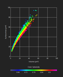
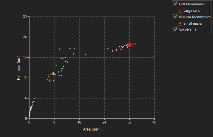
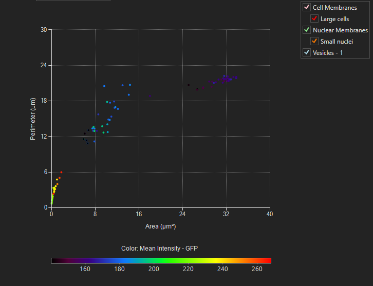
When the scatter plot is opened while an image with objects and measurements is open, the chart will be filled automatically. All objects of all object sets/groups possessing the measurements selected on the axes will be depicted. By default, points will be displayed in the color of their respective object set/group. A legend on the right of the chart will show all object sets/groups and their colors. Within the legend, object groups will be indented and shown below their respective object set. If Color Mode - Measure is chosen from context menu, points will be color coded by the measurement chosen as measurement, A scale will show the color coding.
General usage
Select measurements
As with all charts, to select a measurement, hover over the measurement name until it turns red and then click to bring up a menu of the available measurements. Both the x- and y-axes measurement can be specified in this chart.
Un-/ Select object sets/groups
To remove an object set/group from being displayed in the chart, unselect it from the legend. To show an object set/group, reselect it.
Select objects
Objects on the Scatter Plot can be selected by dragging across the chart to create a box or by a polygon: draw individual points within the chart - subsequent points will be connected by a line, when clicking near the first point, the polygon will be created and enclosed points will be selected. You can also select objects by clicking on them individually and Shift + click to select multiple objects. Selected objects appear with red circles or green circle around the edge. Hovering over an individual data point will bring up the Track Number object name as well as the chart data for that point.
Magnify chart area
Magnifying the chart area can help with visualizing large datasets as it can be difficult to isolate the desired data point.
You can either use the mouse wheel to zoom in or use the Zoom tool:
Mouse wheel
Scrolling the mouse wheel within the chart area will zoom into/out of the area the mouse hovers above. When the mouse hovers above an axis while scrolling, only that axis will be zoomed in / out of.
Zoom Tool
To activate the zoom tool, click on the Zoom Tool  icon. You can drag the mouse cursor while holding the left mouse button to draw a box of the region to magnify. Repeat the magnification region until a desired level is reached. At this point, it is possible to switch to the Selection Cursor to select the data points of interest.
Panning
For panning, click and hold right mouse button anywhere within the chart area and move the mouse.
Change axis scale
To change the scale on any axis, click on the minimum or maximum value displayed and that value will appear in an become editable window. Type in the value desired for the axis and hit Enter. Repeat this for other endpoint value as needed.
Reset chart area
To rest chart area after zooming, panning or changing axes scale click the Reset chart axes-button  .
.
Reduce displayed points
If the number of points in the scatter plot exceeds 10000, the number of points being displayed will automatically be reduced to 10000 and the Reduce data points-button  will appear in the tool bar. Pushing this button evokes a slider which can be used to reduce/increase the number of points shown in the plot. Points are reduced by density ordered quad tree - favoring removal of points in high-density areas. At the bottom of the chart the faction of points currently shown will be indicated. Selecting points by box or polygon will select all points within the area - whether they are currently shown or removed by this point-reduction method.
Analyze multi-well data
(for multi-well data from Experiment Explorer-only)
When the image currently shown in the viewer is from a multi-well experiment of the Experiment Explorer, the Analyze multi-well data-button  will appear in the tool bar. Pushing this button will open a dropdown menu with four options:
Analyze selected image 
This option will plot all objects from the image currently shown in the viewer - just like for a non-multi-well image.
Analyze selected well(s) 
This option will plot all objects from all images of all wells that are currently selected in the Experiment Explorer.
Analyze one condition group 
This option will plot all objects from all images of all wells that have the same condition group as the image currently shown in the viewer.
Analyze all conditions/wells 
This option will plot all objects from all images of all wells. The color of the points will be slightly shifted from the original object set/group color towards the color of the condition group.
Context menu options
You can bring up the context menu by right-clicking anywhere in the Charts Panel. The context menu is specific to the Scatter plot and can be used to adjust chart display options.
| Name | Description |
|---|---|
| Lock X Axis | Locks the x-axis at the current range displayed when this option is selected. Turn off this option to allow the chart to re-scale the x-axis for each time point to best fit the data. |
| Lock Y Axis | Locks the y-axis at the current range displayed when this option is selected. Turn off this option to allow the chart to re-scale the y-axis for each time point to best fit the data. |
| Update during play | With this option selected the Histogram will update to display the current frame when playing an image sequence. If deselected, the chart will update during single frame navigation, but will not update while playing an image sequence until the sequence is paused. |
| Remove selected points from graph | Removes all points that are currently selected form the graph. |
| Show previously removed points | Add all points that were previously removed be the option above. |
| Create object group from selected | (will only be available if all points that are currently selected belong to the same object set) Can be used to gate objects from an object set into a subgroup. Spawns a pop up window to select a group name and color for the new subgroup. Click Apply to create the subgroup. |
| Color mode | Determines how each data point on the chart will be colored; there are three options:
|
| Color for measures | Lets you select the color palette used when the Color by measure mode is selected |
| Assign color | This option brings up the Assign Color dialog. Here you can select a color to apply to all the selected objects. Different colors can be applied each time when selecting a different object or set of objects. This provides an easy way to visualize multiple defined populations |
| Reset color | Select this option to return to the default values for all objects being displayed |
| . |
 |
|---|
| Scatter plot with legend |
|
|---|
Points, color-coded by measure |
Related articles
| Filter by label (Content by label) | ||||||||||||||||||
|---|---|---|---|---|---|---|---|---|---|---|---|---|---|---|---|---|---|---|
|
| Page Properties | ||
|---|---|---|
| ||
|