Charts are graphical representations of the measurement data on the FOV. User can choose from several types of charts to plot the measurement data.
Toolbar
The chart toolbar allows the user to invoke various commands that are common to most charts. Some commands are disabled depending on which chart is selected.

Select chart
Select the chart you want to display by using this dropdown. Selection cursor
Mode that makes it so that clicking or dragging on a chart selects features. Zoom
Zoom
Mode that makes it so that selecting a region on the chart zooms into that region. Reset chart axes
Resets the axes range of the chart to their default values. Toggle legend
Shows or hides the chart legend. Export chart to diagram file
Saves the visual of the chart to a file. Copy chart to clipboard
Copies an image of the chart to a clipboard. Copy chart data to clipboard
Copies the chart data to the clipboard. The format of the data depends on the chart.
| Panel | |
|---|---|
On this page:
|
General usage
Plot measurements
You can specify the measurements to plot in the Charts panel by changing the axis measurements. To select an axis measurement, hover over the measurement name until it turns red and then click to bring up a menu of the available measurements.
Click on the desired measurement in the menu to select. The axis title will change to the selected measurement and the chart data will be refreshed to show the new measurements.
If the chart axis supports multiple measurements, you can select them by holding down the Shift or Ctrl key while clicking on the measurements. The selected measurements will be plotted on the same axis.
Change axis scale
To change the scale on any axis, click on the minimum or maximum value displayed and that value will appear in an editable window. Type in the value you want for that end of the axis and hit Enter. Repeat this for any endpoint value you wish to change.
Additional display options
In general, options for a given chart can be accessed by right-clicking on the chart itself to display the context menu. The context menu is specific to each chart. For details regarding chart options, please refer to the documentation related to the chart of interest.
Types of charts
Aivia has seven types of charts:
| Chart Type | Icon | Description |
|---|---|---|
| Histogram |
| Presents the data for one object set as a binned distribution. Each bar in the Histogram represents the aggregate total number of objects whose measurement values fall within a given range. |
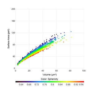
| Scatter plot |
| Allows the user to graph one measurement against another measurement. Each object is represented as a single dot in the chart. |
| Trace plot |
| The default charting option for all data with a time component. It displays a single measurement of selected objects over time. The measurement value is plotted on the y-axis and time on the x-axis. Trace Plot can display data from a single object, whole FOV, or multiple objects simultaneously. |
| Directional plot |
| Takes selected tracks from the data set and places the start point at the origin to show the migration patterns of selected tracks. |
| Lineage plot |
| Displays a single track object at any given time to show when the track splits into two daughter tracks. |
| An enhanced lineage representation, the width and color of this chart are plotted against time to show the evolution of selected track objects and their respective lineages. | |
| Kymograph |
| Depicts of time-related data and creates a new image with defined physical coordinates on the x-axis and time on the y-axis. |
| Pearson heatmap |
| Calculates the Pearson correlation coefficient between pairs of all measurements and presents them color-coded in a heatmap. |
| Violin plot |
| Displays the probability density function for one measurement, adds a swarm or box and whisker plot as an overlay and displays the significance of the mean values according to Welch's t-test. |


More information on each chart type can be found in their respective documentations.
Related articles
| Filter by label (Content by label) | ||||||||||||||||||
|---|---|---|---|---|---|---|---|---|---|---|---|---|---|---|---|---|---|---|
|
| Page Properties | ||
|---|---|---|
| ||
|