Aivia Software
Pearson Heatmap
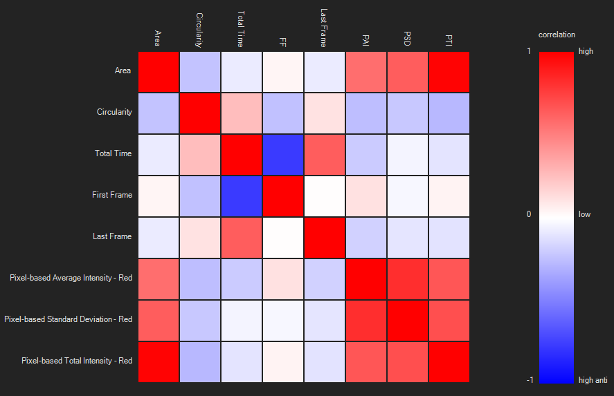
Pearson heatmap is one of the charting options available in the Charts Panel. It calculates the Pearson correlation coefficient between pairs of all measurements of an individual object set/group and presents these color-coded in a heatmap.
To display the Pearson heatmap plot, open the Charts panel and select the Pearson heatmap option  from the Charts selection dropdown menu.
For more detailed information about Pearson correlation coefficient in general, please refer to the Wikipedia entry for Pearson correlation coefficient.
On this page:
Appearance
Individual correlation coefficients between pairs of measurements are displayed as colored squares (see image on the right). Correlation coefficients range from high correlation (1) over low correlation (0) to high anti-correlation (-1). A legend on the right of the heatmap shows the corresponding color-coding. Hovering above a square will display the measurements and the correlation coefficient value of that square.
General usage
Select object set/group
To change the object set/group plotted, select them from the object set/group selection list on the left of the chart.
Change heatmap color
To change the colors used to display the heatmap, click on the upper quarter of the color-coding legend to change color for high correlation, or the lower quarter to change color for high anti-correlation, select a new color from the pop-up window and click the Apply-button.
Refresh chart
When anything is done in any other part of the software that influences the measurements displayed in the Pearson heatmap, a Refresh-button appears - the chart will not update automatically. Click the Refresh-button when all changes are completed and the heatmap will refresh.
 |
|---|
| Pearson heatmap and legend |