Aivia Software
Binned Scatter Plot
To display the Binned scatter plot, open the Charts panel and select the Binned scatter plot option  from the Charts selection dropdown menu.
On this page:
Appearance
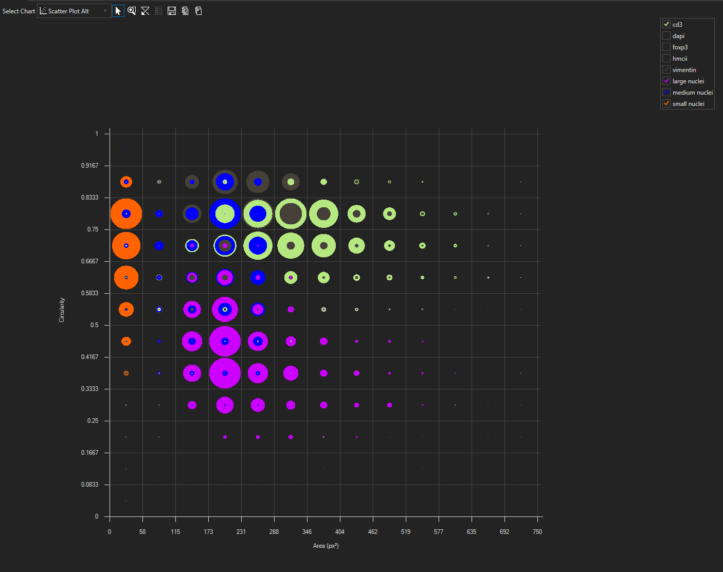
When the Binned scatter plot is opened while an image with objects and measurements is open, the chart will be filled automatically. All objects of three object sets/groups possessing the measurements selected on the axes will be depicted. By default, points will be displayed in the color of their respective object set/group. A legend on the right of the chart will show all object sets/groups and their colors. Within the legend, object groups will be indented and shown below their respective object set.
Select measurements
As with all charts, to select a measurement, hover over the measurement name until it turns red and then click to bring up a menu of the available measurements. Both the x- and y-axes measurement can be specified in this chart.
Un-/ Select object sets/groups
To remove an object set/group from being displayed in the chart, unselect it from the legend. To show an object set/group, reselect it. Default number of object sets/groups shown in the graph is three, but more can be selected.
Select objects
Objects on the Binned scatter plot can be selected by dragging across the chart to create a box or by a polygon: draw individual points within the chart - subsequent points will be connected by a line, when clicking near the first point, the polygon will be created, clicking the right mouse button will delete all polygon points. For all selection methods: all points within a square are selected if the box/polygon encloses the midpoint of the square. To add to formerly selected points hold Shift while drawing box/polygon, to toggle selection hold Control.
Tooltip
Hovering above a square, will bring up the counts for each object set/group within the square.
Magnify chart area
Mouse wheel
Scrolling the mouse wheel within the chart area will increase/decrease the number of bins. The minimum bin count is 1.
Zoom Tool
To activate the zoom tool, click on the Zoom Tool  icon. You can drag the mouse cursor while holding the left mouse button to draw a box of the region to magnify. Repeat the magnification region until a desired level is reached. At this point, it is possible to switch to the Selection Cursor to select the data points of interest.
Panning
For panning, click and hold right mouse button anywhere within the chart area and move the mouse, while Zoom Tool is selected.
Change axis scale
To change the scale on any axis, click on the minimum or maximum value displayed and that value will become editable. Type in the value desired for the axis and hit Enter. Repeat this for other endpoint value as needed.
Reset chart area
To rest chart area after zooming, panning or changing axes scale click the Reset chart axes-button  .
.
Context menu options
You can bring up the context menu by right-clicking anywhere in the Charts Panel. The context menu is specific to the Binned scatter plot and can be used to adjust chart display options.
| Name | Description |
|---|---|
| Update during play | With this option selected the Histogram will update to display the current frame when playing an image sequence. If deselected, the chart will update during single frame navigation, but will not update while playing an image sequence until the sequence is paused. |
| Normalize | Normalizes each object set/group individually. |
|
|---|
| Scatter plot alt with legend |