Aivia Software
Dendrogram
Dendrogram is one of the charting options available in the Charts Panel. A dendrogram is a tree-like diagram that displays the hierarchical structure of data. It is most commonly used in hierarchical clustering to depict the arrangement of the clusters produced1,2. Each leaf (or tip) of the dendrogram represents an individual data point, and the merging branches represent the joining of two clusters.
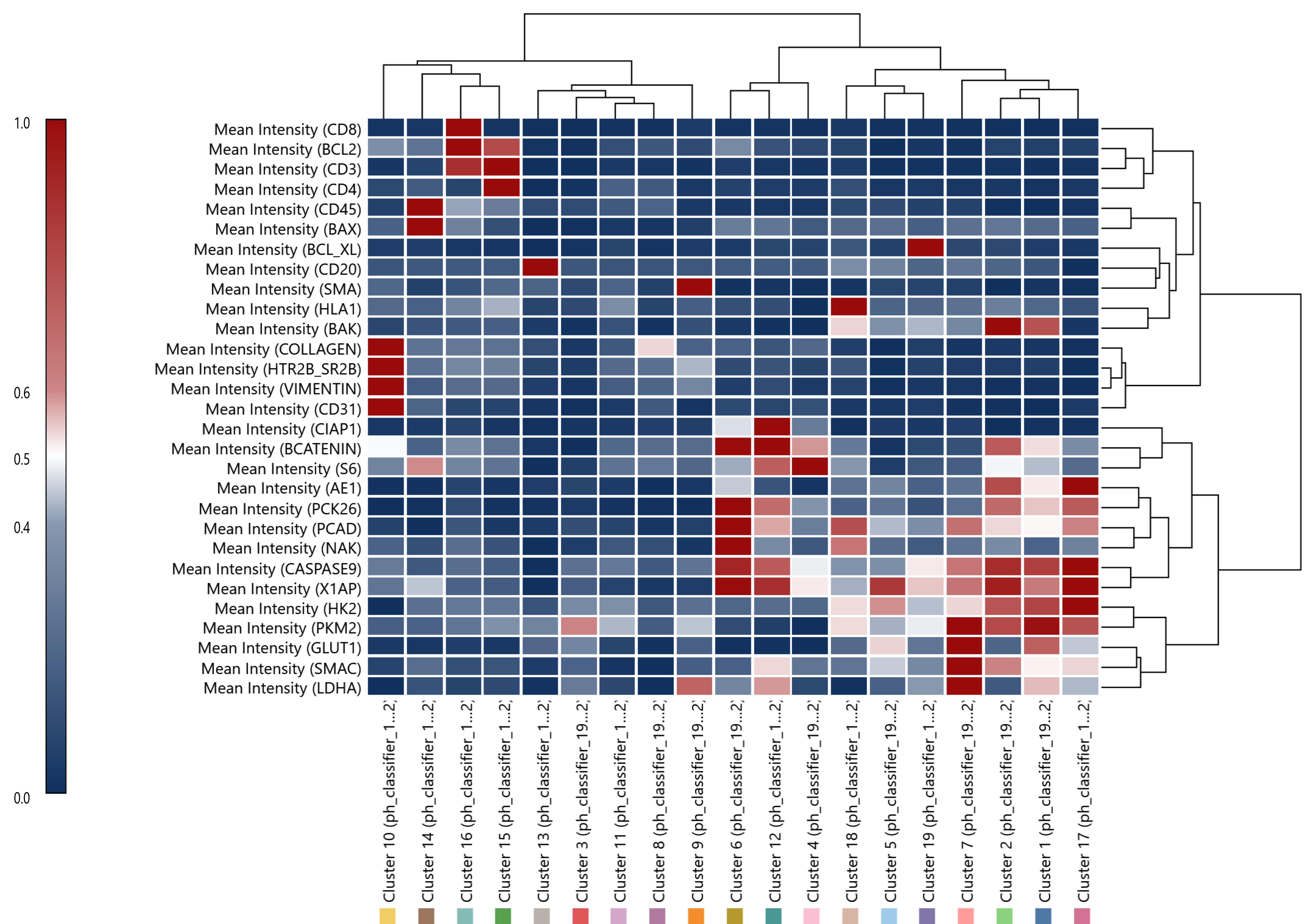
A heatmap is a data matrix where individual values are represented as colors. The color scheme (often on a spectrum, like blue to red or green to red) represents anything from low to high values. When a heatmap is paired with a dendrogram, it forms a combined visualization tool that allows for a detailed representation of the hierarchical structure of data alongside the actual values or characteristics of that data—the dendrogram allows you to understand the hierarchical structure, while the heatmap provides a quick way to identify patterns, trends, or outliers within and across the clusters.
Dendrograms are usually the result of a hierarchical clustering process3:
- Initialization
Each data point is treated as a single cluster, meaning if there are N data points, you start with N clusters. - Agglomeration
In each subsequent stage, the two clusters that are closest to each other are merged into a single cluster, reducing the total number of clusters by one. The distance between clusters can be computed using various methods, such as single, complete, or centroid linkage. - Repeat until complete
This process is repeated until there is only one single cluster left, containing all data points. The result of this process can be visualized using a dendrogram.
To display the Dendrogram plot, open the Charts Panel and select the Dendrogram plot option ![]() from the Charts selection dropdown menu.
from the Charts selection dropdown menu.
For detailed information about dendograms in general, please refer to the Wikipedia entry for Dendrograms.
On this page:
General usage
Select measurements
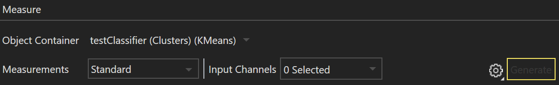
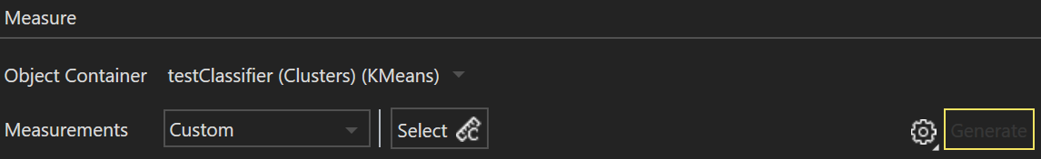
Upon opening the Dendrogram panel with an active image containing objects and measurements, users are prompted to specify additional parameters corresponding to the object's attributes they wish to cluster. The object container must have a minimum of one child in the selected object container.
Attributes to run hierarchical clustering on can then be selected in the drop down menu next to Measurements as Standard or Custom, with individual channels/attributes selected in the resulting menu to the right. Standard is for intensity measurements and Custom is for morphological mreasurements for detected objects.
Transpose Dendrogram
By default, clusters are ordered at the bottom of the dendrogram along the X-axis, while measurements are aligned along the vertical Y-axis. To transpose the dendrogram's appearance, press the gear icon ![]() and access the drop-down menu item Transpose Dendrogram
and access the drop-down menu item Transpose Dendrogram 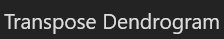 .
.
Display Normalized or Raw values in Dendrogram
Raw values in the dendrogram are determined by scaling each measure based on their z-score, which tells us how many standard deviations away from the mean is a given value in our data.
By default, the values plotted on the heatmap associated with the dendrogram are normalized to the minimum and maximum z-score value. To toggle to raw z-score normalization values, press the gear icon ![]() and access the drop-down menu item to press Plot Raw Data
and access the drop-down menu item to press Plot Raw Data 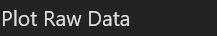 . Once pressed, the raw data will be displayed and the button will switch to Plot Normalized Data
  to toggle back to normalized values.
Export chart to diagram file
To export the chart to a *.bmp, *.jpg, or *.png file, press the Export chart to diagram ![]() icon.
icon.
Copy chart to clipboard
To copy the chart to your system clipboard, press the Copy chart to clipboard ![]() icon.
icon.
Copy chart data to clipboard
To save the chart data as a file, press the Copy chart data to clipboard ![]() icon. This will open a save prompt where you can save an *.xlsx file containing the chart values presently being displayed to your computer.
icon. This will open a save prompt where you can save an *.xlsx file containing the chart values presently being displayed to your computer.
Interpretation
The dendrogram in each chart is represented on the top and right of the heatmap, as outlined in red boxes in the example below:
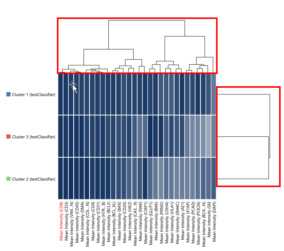
The positioning of the following dendrogram attributes are described relative to the upper dendrogram with respect to vertical and horizontal lines3. The same statements can be made for the dendrogram on the right side of the heatmap, with vertical/horizontal swapped.
Vertical Lines
Represent the joining of two clusters. The height of the vertical line represents the distance at which the two clusters were joined.
Horizontal Lines
Are used merely to connect two vertical lines, indicating which clusters merged.
Leaves, or the tips of the dendrogram
Represent individual data points or original unmerged clusters.
Heatmap
The underlying heatmap displays the values of the data matrix. Darker or lighter shades, or changes in color, represent the relative values of the data. This provides a snapshot of data values across different clusters.
|
|---|
| Example normalized Dendrogram chart |
References
- Sokal RR, Rohlf FJ. The comparison of dendrograms by objective methods. Taxon. 1962 Feb 1:33-40.
- Podani J, Schmera D. On dendrogram‐based measures of functional diversity. Oikos. 2006 Oct;115(1):179-85.
- Glen, S. Hierarchical Clustering / Dendrogram: Simple Definition, Examples. From StatisticsHowTo.com: Elementary Statistics for the rest of us!. https://www.statisticshowto.com/hierarchical-clustering/.