Aivia Software
Dimensionality Reduction
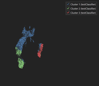
Dimensionality Reduction is one of the charting options available in the Charts Panel. It displays the relationships between data points in a reduced dimensional space, typically plotting the first two principal components or manifold embeddings on the x- and y-axes, with each dot representing an individual data point or object from the dataset.
To display the Dimensionality Reduction plot, open the Charts Panel and select the Dimensionality Reduction plot option ![]() from the Charts selection dropdown menu.
from the Charts selection dropdown menu.
For detailed information about dimensionality reduction in general, please refer to the Wikipedia entry for Dimensionality Reduction.
On this page:
Appearance
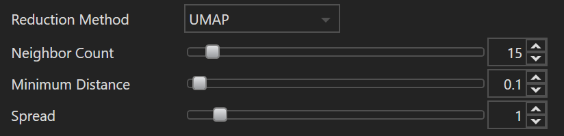
When the Dimensionality Reduction panel is opened while an image with objects and measurements is open, additional parameters must be supplied depending on the method of dimensionality reduction desired. Available options are UMAP1, PaCMAP2, and t-SNE3. Once the dataset has been reduced in dimensionality, the resulting 2D chart will appear. A legend on the right of the chart will show all object sets/groups and their colors.
General usage
Select Measurements
To select the objects to run dimensionality reduction on, select the object container in the respective drop down menu.In the Measurements section, you have the option to choose Standard or Custom. Selecting Standard permits you to pick from the image’s channels to use their mean intensities as features for object mapping. Selecting Custom Allows for selection of additional object features and other image channel properties as features for object mapping.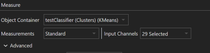

Additional methods can be selected under the Advanced drop down arrow. Available methods include UMAP, PaCMAP, and t-SNE. Additional information on parameter tuning for each of the individual methods can be found on their respective wiki pages.
Un-/ Select object sets/groups
To remove an object set/group from being displayed in the chart, unselect it from the legend. To show an object set/group, reselect it.
Select objects
Objects on the plot can be selected by dragging across the chart to create a box or by a polygon: draw individual points within the chart - subsequent points will be connected by a line, when clicking near the first point, the polygon will be created and enclosed points will be selected. You can also select objects by clicking on them individually and Shift + click to select multiple objects. Selected objects appear with red or green circle around the edge. Hovering over an individual data point will bring up the object name as well as the chart data for that point.
Panning
For panning, click and hold right mouse button anywhere within the chart area and move the mouse.
Reduce displayed points
If the number of points in the scatter plot exceeds 10000, the number of points being displayed will automatically be reduced to 10000 and the Reduce data points-button  will appear in the tool bar. Pushing this button evokes a slider which can be used to reduce/increase the number of points shown in the plot. Points are reduced by density ordered quad tree - favoring removal of points in high-density areas. At the bottom of the chart the faction of points currently shown will be indicated. Selecting points by box or polygon will select all points within the area - whether they are currently shown or removed by this point-reduction method.
Context menu options
You can bring up the context menu by right-clicking anywhere in the Charts Panel. The context menu is specific to the Scatter plot and can be used to adjust chart display options.
| Name | Description |
|---|---|
| Lock X Axis | Locks the x-axis at the current range displayed when this option is selected. Turn off this option to allow the chart to re-scale the x-axis for each time point to best fit the data. |
| Lock Y Axis | Locks the y-axis at the current range displayed when this option is selected. Turn off this option to allow the chart to re-scale the y-axis for each time point to best fit the data. |
| Update during play | With this option selected the Histogram will update to display the current frame when playing an image sequence. If deselected, the chart will update during single frame navigation, but will not update while playing an image sequence until the sequence is paused. |
| Remove selected points from graph | Removes all points that are currently selected form the graph. |
| Show previously removed points | Add all points that were previously removed be the option above. |
| Create object group from selected | (will only be available if all points that are currently selected belong to the same object set) Can be used to gate objects from an object set into a subgroup. Spawns a pop up window to select a group name and color for the new subgroup. Click Apply to create the subgroup. |
| Color mode | Determines how each data point on the chart will be colored; there are three options:
|
| Color for measures | Lets you select the color palette used when the Color by measure mode is selected. |
Methods for Dimensionality Reduction
UMAP (Uniform Manifold Approximation and Projection)
UMAP (Uniform Manifold Approximation and Projection)1 is a modern dimensionality reduction technique primarily use for visualization of high-dimensional datasets. It is similar in purpose to t-SNE, but is generally faster and can handle larger datasets. UMAP operates on the principle of preserving the topological structure of the data through leveraging Riemannian geometry and algebraic topology to approximate the underlying manifold of the data. By capturing both local and global structures, it provides a comprehensive view of data clusters and relationships.
Parameters
| Name | Default Value | Minimum Value | Maximum Value | Description |
|---|---|---|---|---|
| Neighbor Count | 15 | 2 | 200 | This parameter determines the size of the local neighborhood UMAP will consider when approximating the manifold. A higher value focuses more on preserving the global structure of the data, while a lower value prioritizes preserving local relationships. In practical terms, if the neighbor count is too low, UMAP may emphasize preserving noise or small structure variations. Conversely, setting this too high can potentially blur distinct clusters together. |
| Minimum Distance | 0.1 | 0.0 | 5.0 | The minimum distance parameter controls the minimum distance allowed between points in the lower-dimensional space UMAP produces. A value close to 0 will cause embedded points to clump together, even potentially overlapping, allowing the user to identify dense regions or clusters more clearly. A larger value will spread the points out more evenly in the embedding. This parameter doesn't influence the layout of the clusters but rather controls how tightly-packed or spaced-out those clusters are. |
| Spread | 1.0 | 0.0 | 10.0 | Spread determines the effective scale of embedded points. It acts as a scale factor that stretches or contracts the entire UMAP layout. If your layout appears too tightly clustered, increasing the spread can help to expand the layout, making clusters more discernible. Conversely, if the layout is too spread out, reducing this parameter can bring the points closer together. It essentially controls the balance between preserving local versus global structures in the data. This parameter works in conjunction with |
Advantages
Preserves local and global structure
UMAP can capture non-linear relationships in data, making it effective for complex datasets. It retains both local and global structures in the data, making it suitable for a wide range of applications.
Speed and scalability
UMAP is computationally efficient and scales well to large datasets compared to some other dimensionality reduction methods like t-SNE4.
Parameter tuning
UMAP offers flexibility in parameter tuning, allowing users to fine-tune the trade-off between preserving local and global structures.
Disadvantages
Interpretability
The UMAP embedding may not be as interpretable as some other methods, like PCA, which provide more intuitive insights into the data.
Sensitivity to hyperparameters
UMAP's performance can be sensitive to hyperparameter choices, and finding the right parameters may require experimentation.
Limited in high dimensions
Like many dimensionality reduction methods, UMAP can suffer from the curse of dimensionality and may not work well in very high-dimensional spaces.
Computational resource requirements
While UMAP is generally faster than t-SNE, it can still be computationally expensive for extremely large datasets.
PaCMAP (Pairwise Controlled Manifold Approximation)
PaCMAP (Pairwise Controlled Manifold Approximation)2 is a dimensionality reduction technique introduced as an alternative to methods like t-SNE and UMAP. The method is designed to balance between preserving local and global structures in the data, addressing some of the other challenges observed with other techniques. It introduces a pairwise attraction and repulsion term to control the balance during manifold learning, and is noted for its speed and ability to handle large datasets while producing interpretable embeddings.
Parameters

| Name | Default Value | Minimum Value | Maximum Value | Description |
|---|---|---|---|---|
| Neighbor Count | 10 | 2 | 200 | This parameter specifies the number of nearest data points considered for each point during dimensionality reduction in PaCMAP. Low values emphasize local data relationships, preserving the closeness of neighboring points. High values capture broader, global data structures, focusing on relationships between distant points. Adjusting this value can help balance between highlighting local details and overall dataset structure. Experimentation may be necessary to determine the best setting for your data. |
Advantages
Hybrid Approach
PacMAP incorporates both local and global structure preservation, aiming to capture the best of both worlds from methods like t-SNE (local) and PCA (global). PacMAP is designed to combine the advantages of t-SNE (local structure preservation) and UMAP/PCA (global structure preservation).
Flexibility in preserving local and global structure
The method can be adjusted to emphasize either local or global structures, depending on the nature of the data and the user's goals.
Reduced Crowding Problem
The method seeks to alleviate the "crowding problem" common in t-SNE, which can cause clusters to be pushed too far apart.
Reduced Stochasticity
Offers more consistent results across runs compared to the stochastic nature of t-SNE. While there are parameters to tweak, the method is designed to be more robust to parameter changes than t-SNE.
Disadvantages
Complexity and familiarity
Being a hybrid method, PaCMAP might be harder to understand for users familiar with simpler, single-objective methods. Some data analysis communities might be less familiar with PacMAP, leading to potential challenges in adoption or interpretation. Being newer, it may not have been as extensively vetted in diverse applications as longer-standing methods like t-SNE or PCA.
Parameter Sensitivity
While designed to be more robust to parameter changes, it's still possible for results to vary based on parameter choices. Depending on the data, there is a risk of over-emphasizing either local or global structures if not tuned correctly.
Interpretability
Like other dimensionality reduction techniques, interpreting the reduced dimensions can still be non-intuitive.
t-SNE (t-Stochastic Neighbor Embedding)
t-SNE (t-Stochastic Neighbor Embedding)3 is a popular dimensionality reduction method use for the visualization of high-dimensional data. t-SNE works by preserving the local structure of the data, often resulting in clear separation of clusters. Unlike PCA (Principal Component Analysis) that focuses on maximizing variance, t-SNE emphasizes on keeping similar distances close and dissimilar ones apart in the reduced space. However, due to its emphasis on local structures, it sometimes exaggerates clusters and may not always preserve the global structure of data. This method is computationally intensive, especially for large datasets.
Parameters

| Name | Default Value | Minimum Value | Maximum Value | Description |
|---|---|---|---|---|
| Neighbor Count | 10 | 2 | 200 | The neighbor count, often referred to as "perplexity" in t-SNE, represents a balance between preserving local and global structures in the data. Essentially, it indicates the number of neighboring points used to construct a probability distribution for each point in the dataset. A higher value gives more weight to distant points, emphasizing global structure, while a lower value focuses on local structure. It is essentially a guess about the number of close neighbors each point has. Commonly used values range from 5 to 50, but the optimal setting may vary depending on the dataset's characteristics. |
Advantages
Preservation of Local Structures
t-SNE excels at preserving local structures in the data, making it effective for identifying clusters of similar data points.
Flexibility
It can handle non-linear data structures effectively, unlike certain linear methods such as PCA.
Visualization
Particularly useful for visualizing high-dimensional data in two or three dimensions.
Disadvantages
Computational Intensity
The algorithm can be computationally expensive, especially with large datasets.
Stochastic Nature
The final visualizations can vary between runs due to the algorithm's randomness, which might lead to inconsistencies.
Hyperparameter Sensitivity
Results can be sensitive to the choice of perplexity.
Interpretability
The distances between clusters in the t-SNE plot do not always have meaningful interpretations. The algorithm prioritizes preserving local structures over global ones. The density of data points in the t-SNE visualization does not necessarily represent the density in the original high-dimensional space.
Optimal for Visualization Only
While great for visualization, t-SNE embeddings may not always be suitable as input for other machine learning algorithms.
|
|---|
| Dimensionality Reduction UMAP plot with legend |
References
- Becht E, McInnes L, Healy J, Dutertre CA, Kwok IW, Ng LG, Ginhoux F, Newell EW. Dimensionality reduction for visualizing single-cell data using UMAP. Nature biotechnology. 2019 Jan;37(1):38-44.
- Wang Y, Huang H, Rudin C, Shaposhnik Y. Understanding how dimension reduction tools work: an empirical approach to deciphering t-SNE, UMAP, TriMAP, and PaCMAP for data visualization. The Journal of Machine Learning Research. 2021 Jan 1;22(1):9129-201.
- Van der Maaten L, Hinton G. Visualizing data using t-SNE. Journal of machine learning research. 2008 Nov 1;9(11).
- McInnes L, Healy J, Melville J. Umap: Uniform manifold approximation and projection for dimension reduction. arXiv preprint arXiv:1802.03426. 2018 Feb 9.